Good Neighbor Hotel Rebrand
Staying at an off-property accommodation doesn’t have to feel any less magical! A Good Neighbor Hotel stay is a great way to start your Disney day—all “in the neighborhood” of The Happiest Place on Earth.
Project:
Good Neighbor Hotel Rebrand
Client:
Disneyland Resort
Staying at an off-property accommodation doesn’t have to feel any less magical! A Good Neighbor Hotel stay is a great way to start your Disney day—all “in the neighborhood” of The Happiest Place on Earth.
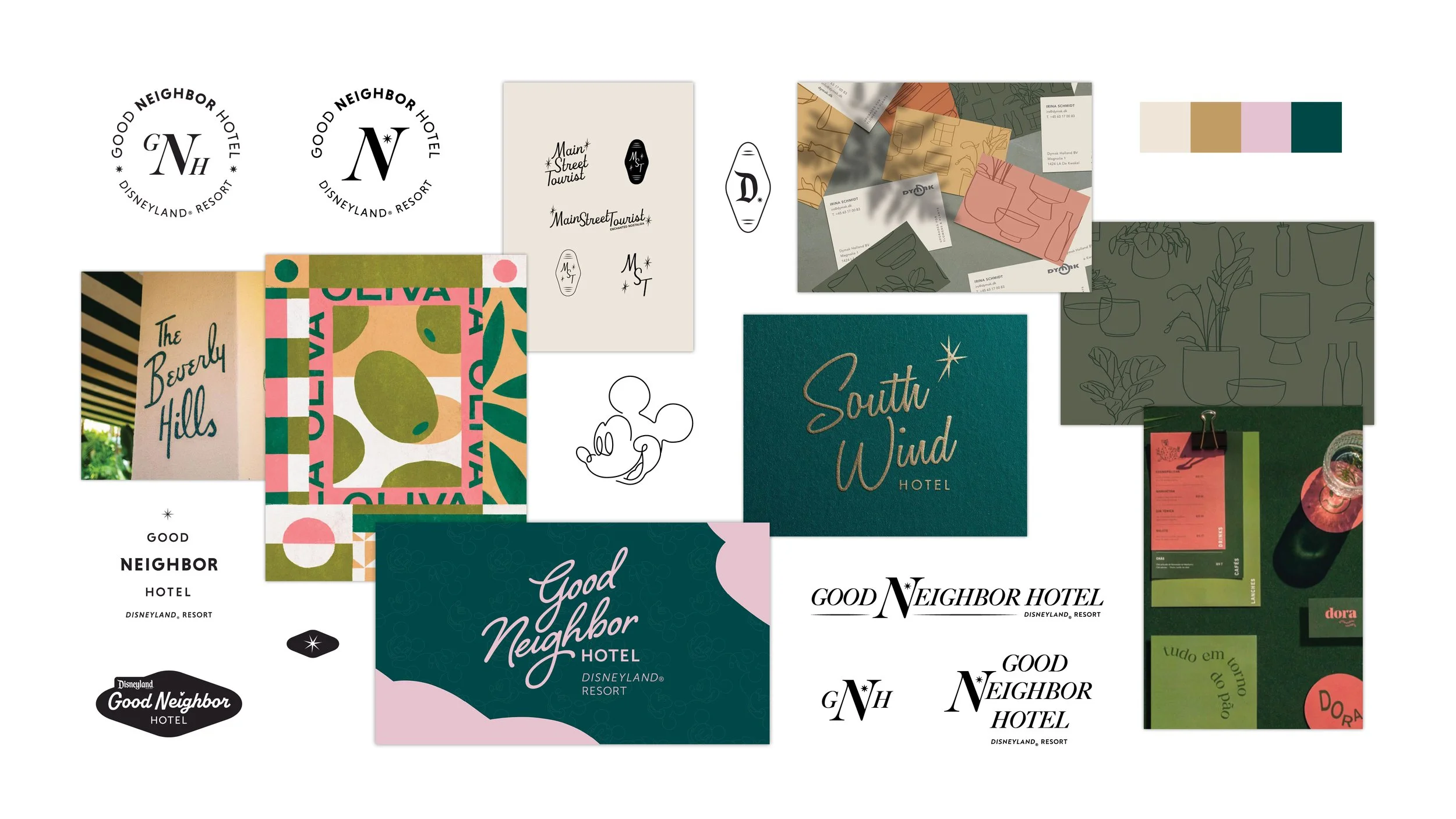
Inspiration + early development (concept 1)
Being that this rebrand is specific to our Good Neighbor Hotels in California, I took inspiration from California’s extensive hotel history that has mid-century modern influences. Disney has its own extensive mid-century modern history, so something like this direction fits well into the Disney brand, combining the charm of a Californian stay with the magic that only Disney can provide.
The color palette takes inspiration from The Beverly Hills hotel while being open enough to be applied to our many Good Neighbor Hotels that span a variety of value. I had also envisioned this brand direction living with an eclectic, organic Mickey Mouse pattern that would play off the script logo direction nicely.
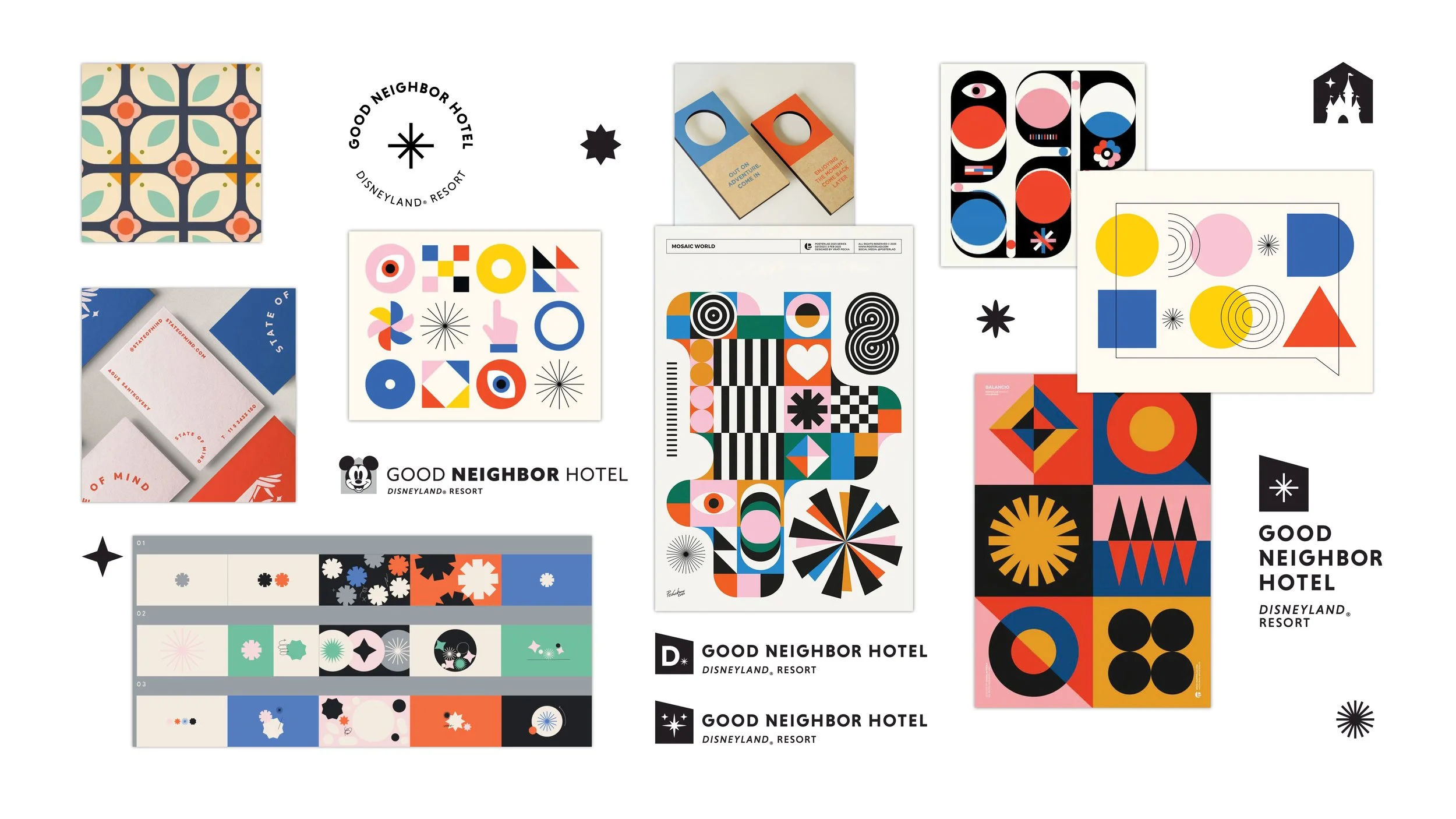
Inspiration + early development (concept 2)
This second concept is a new kind magical, incorporating fun shapes that are eye-catching and blend well into the Disney brand. I was directly inspired by the top left for color inspiration, as this color palette fits well across a variety of our Good Neighbor Hotel interiors, and also has a sense of comfort that is appropriate for the hotel space.
Across both concepts, I intentionally used muted colors rather than overly eccentric colors since extremely bright colors would interrupt many of our Good Neighbor Hotel spaces that do veer more muted for the sake of being a relaxing place you can come to after a long day in the Parks. When I toured some of our Good Neighbor Hotels, this was actually also a request from the hotel managers for the same reasons.
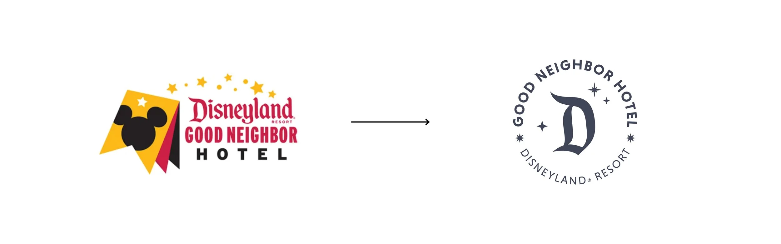
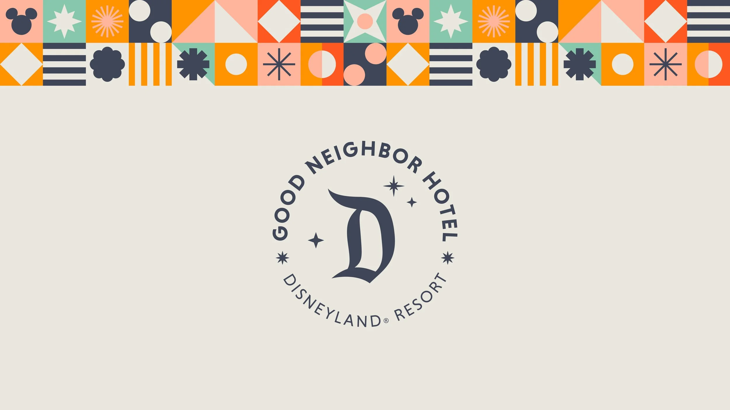
The previous brand logo had a vibrant color palette and dated look that was difficult to integrate across multiple values of Good Neighbor Hotels.
The new logo has a nice stamp-like appearance that appears like a Disney stamp of approval on our Good Neighbor Hotels. The D is pulled from our Disneyland logo, and this works hard to connect the brand back to Disney and evoke proximity between our Good Neighbor Hotels and the Parks. I also included multiple stars that not only add that pixie dust Disney magic but also convey the multiple hotel offerings available.
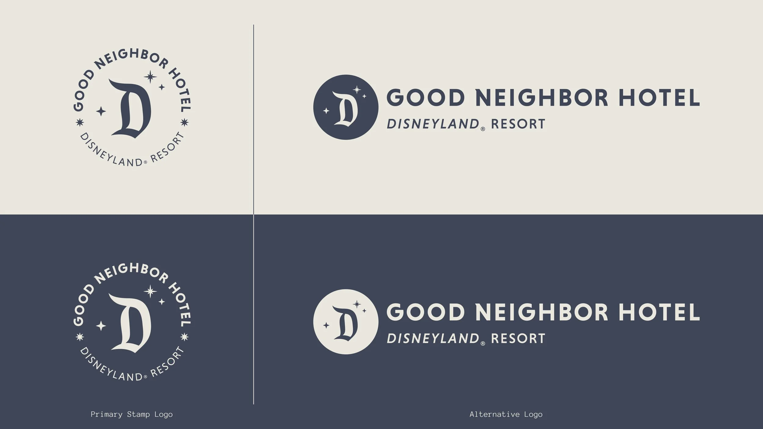
In addition to the primary stamp logo, I created an alternative logo to be used in spaces where legibility of the stamp logo could be compromised. This was especially useful for the social post experimentation presented later on this page.
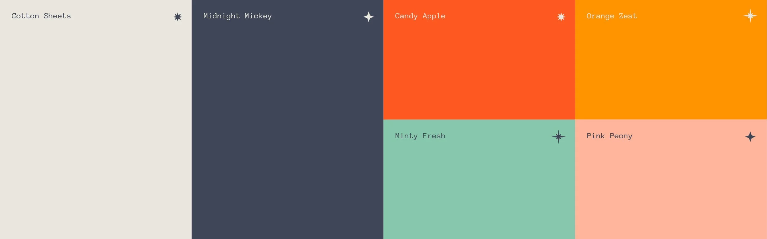
The brand color palette is muted with small pops of color, bringing in light fun that doesn’t veer too eccentric, appropriate for a hotel environment that guests should return to with a sense of comfort after a long day in the Parks.
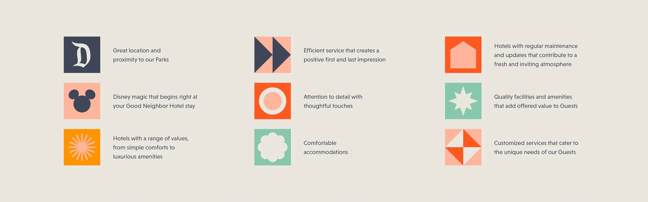
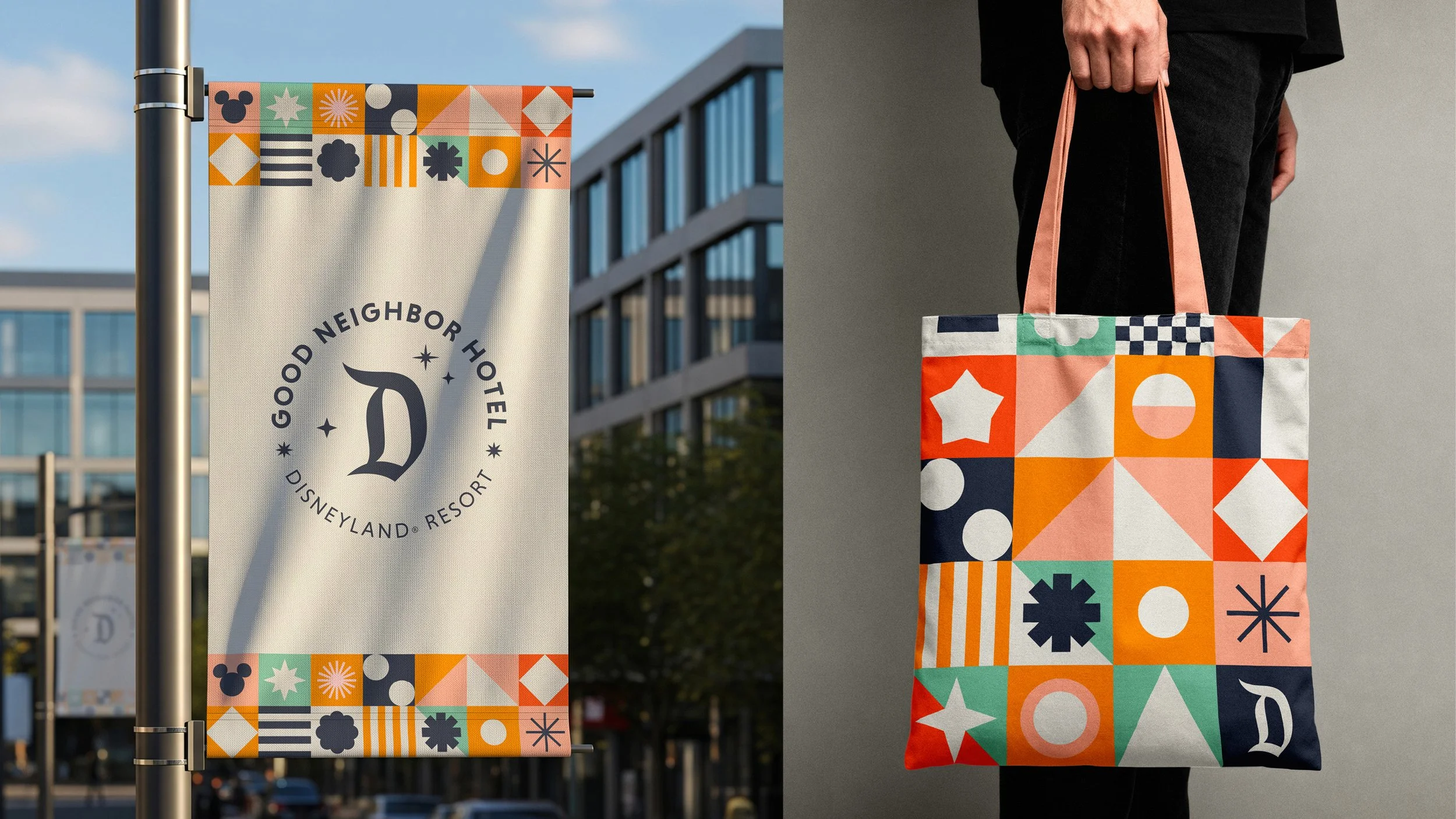
As I was thinking of the branding, I began thinking of these pillars that represent what makes a Good Neighbor Hotel a great stay. And in representing each of these, I created an abstract visual language that formed the graphic approach for the brand.
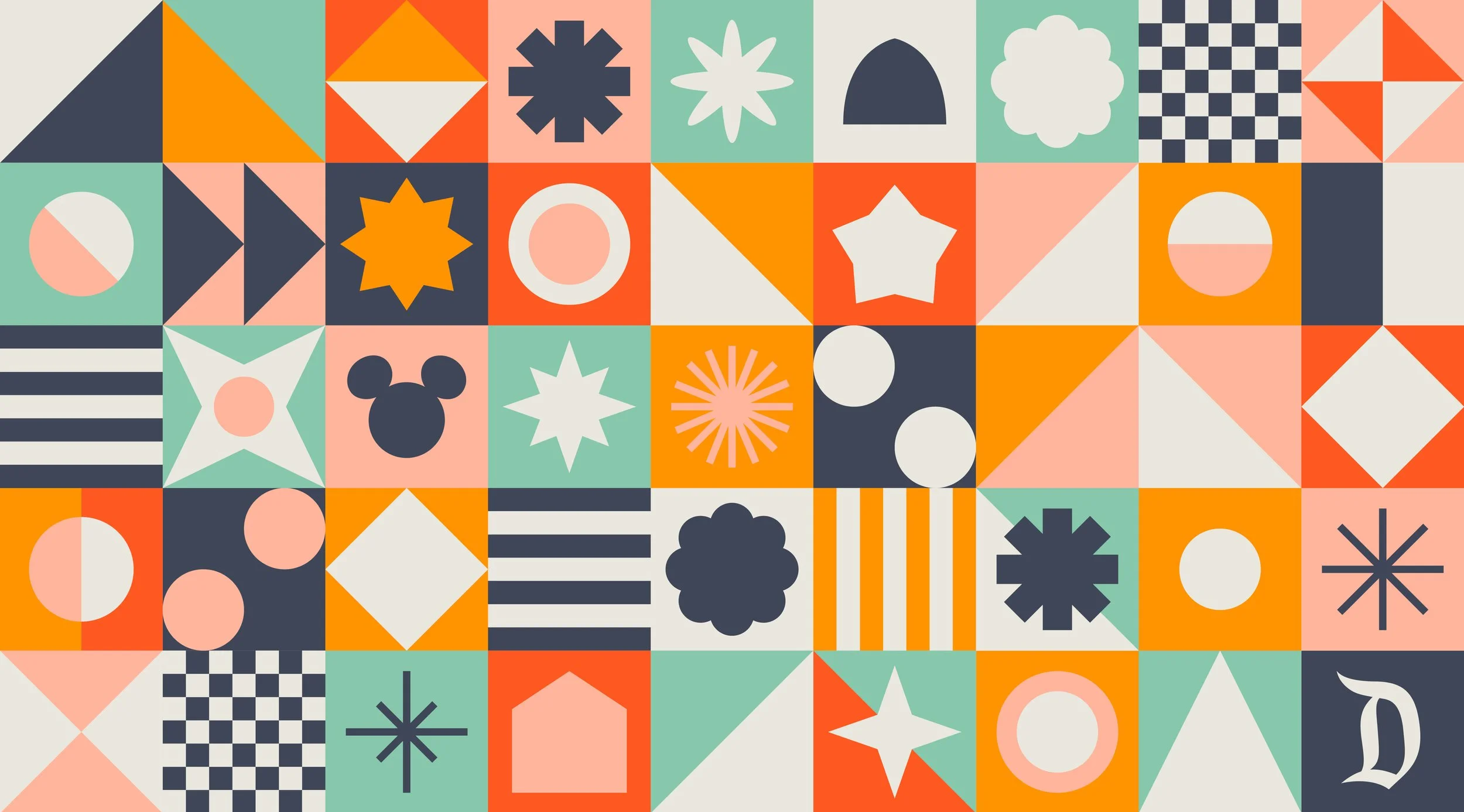
The abstract representations of each brand pillar worked nicely together as a pattern that can be applied across various future materials.
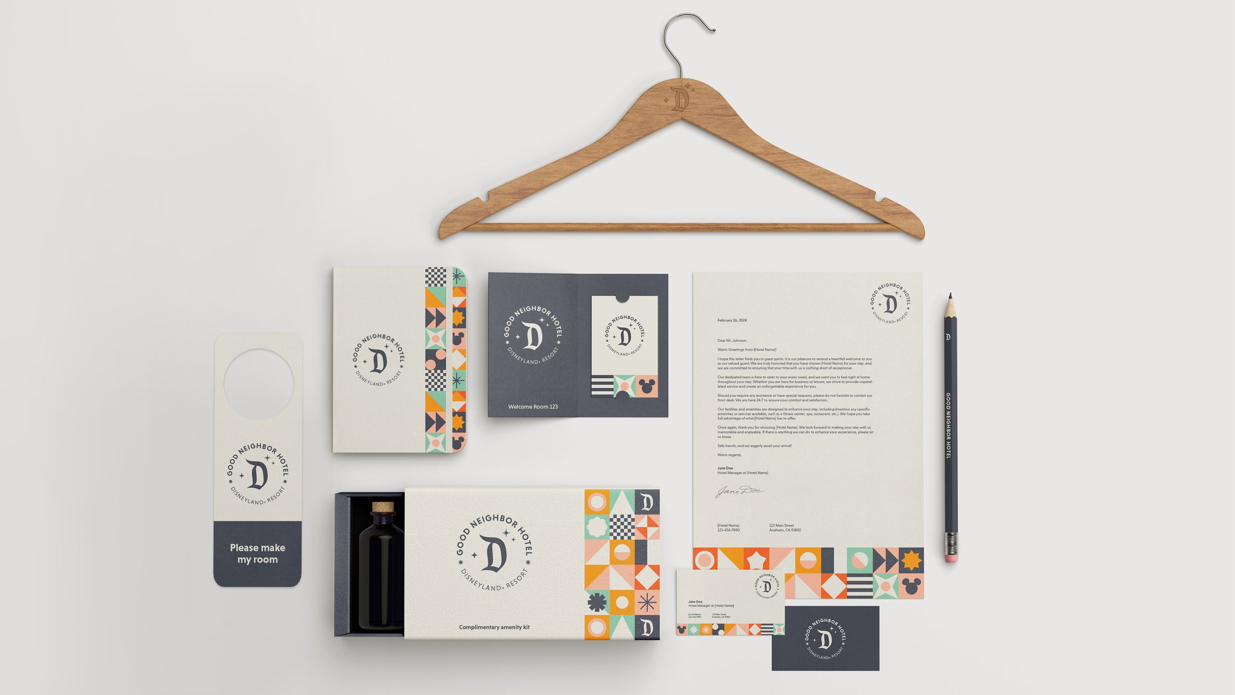
Here, you can see how the pattern can be used to lightly accentuate brand materials, adding the magical pop Disney is known for while still being appropriate for a relaxing hotel space.
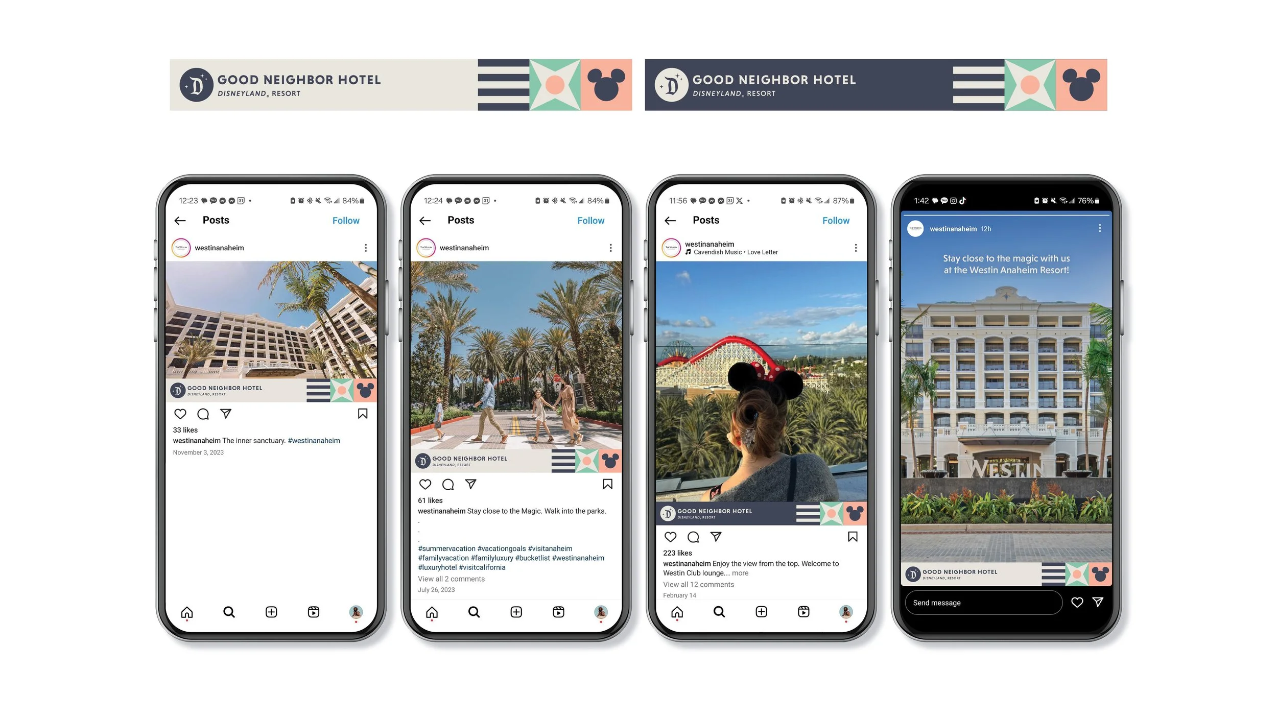
I also designed a system the hotels can use for specifically their photography-based social posts to convey that they are a Good Neighbor Hotel. No matter what size the post is, the “bar” is intentionally placed at the bottom not only as a locator, but also as the most balanced way for each Hotel’s separate brand to have its own chance to shine in partnership with Disney. It also includes a hint of the brand pattern, including Mickey Mouse, to tie it closer to Disney and the Good Neighbor Hotel brand.
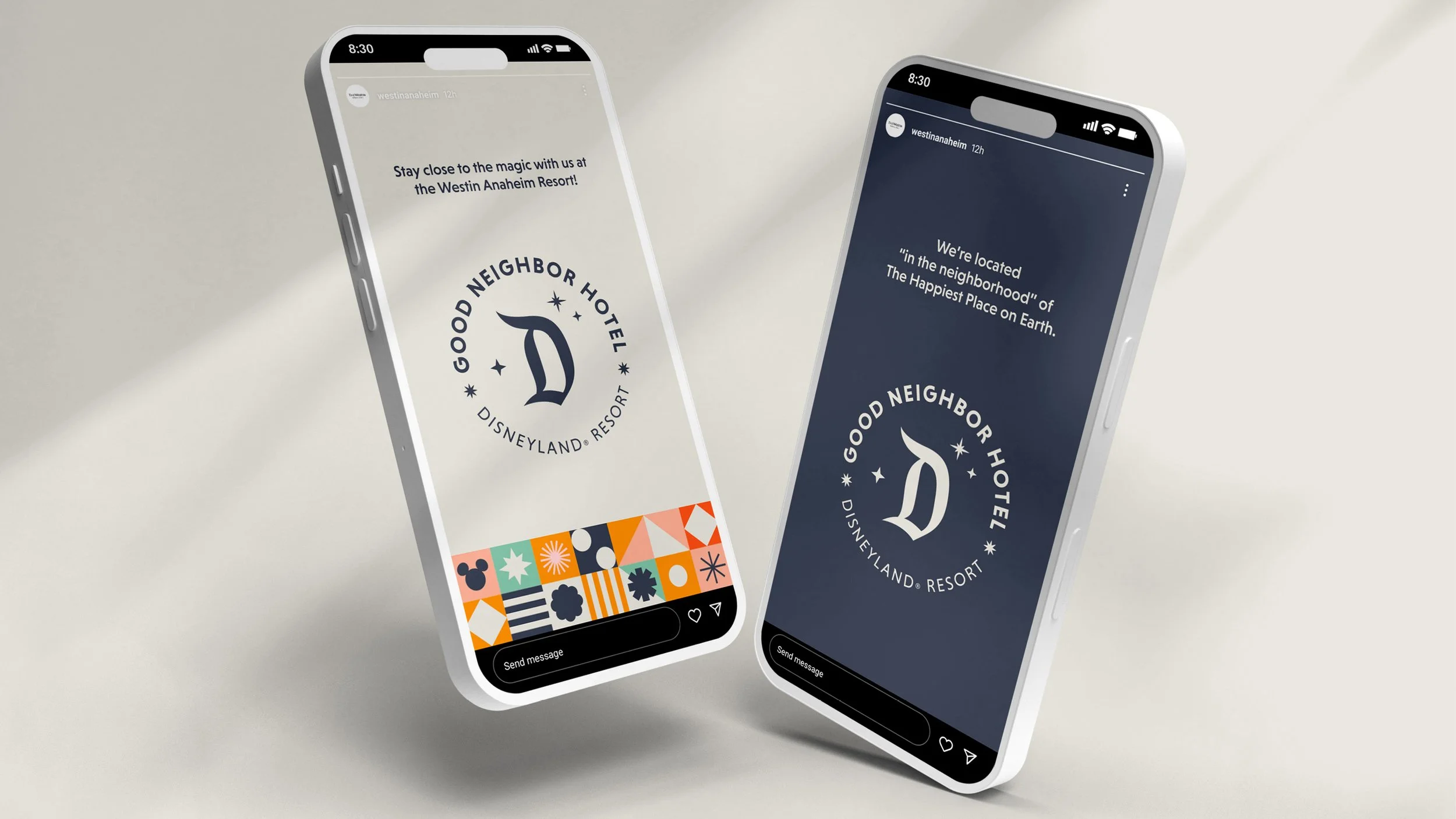
For the hotels’ graphic-based social media, the hotels can revert to the primary stamp logo usage, which is clearly legible above clear flat color backgrounds featuring the brand's colors of Cotton Sheets or Midnight Mickey.

Client — Disneyland Resort
Year — 2024
|
Senior Designer + Style Guide Copywriter — Unitha Ramirez
Design Director — Lacye Beauregard
Group Design Director — Agnete Oernsholt
̌